The timeline function displays the changing frequency of a word or phrase over time. Timelines are not a standalone tool, they are included in the Concordance and Wordlist tools. Timelines are computed the same as the graphs in Trends – a diachronic analysis of word usage, however, they can be generated for any word or even multi-word phrase the graph displays more details.
Timelines in the Concordance
The timeline represents the frequency of KWIC (single- or multi-token) over time. Any concordance search (basic, CQL etc.) can be used to generate the source concordance.
Quick and easy steps to view timeline graphs:
- Go to the Concordance and perform a search as you would normally do.
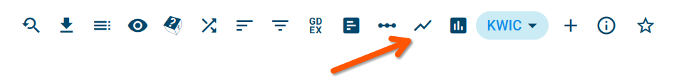
- Click the Timeline icon show_chart above the concordance results

Display absolute frequency (bars in grey), which is usually not useful, especially when periods are unequal in size.
Remove empty data from the beginning and end of the chart.
Filter out data from periods that are too small – the size in tokens is smaller than a specified percentage of the average period size.
Timelines in the Wordlist
Timelines in the Wordlist display a small graph for each word on the result screen. You can use any criteria to generate the source wordlist. (See the guide to learn to do this.) Generating the graphs with large multi-billion corpora can be slow (dozens of seconds).
To display the timelines
- Go to the Wordlist tool and generate a word list as you would normally do.
- Click the Timeline button show_chart above the results

Turn on/off the timeline graphs and available settings such as showing absolute frequency, selecting period, or setting up threshold.
This warning shows when the number of results exceeds 10 million. In this case, the values are extrapolated (read more about Extrapolation on Wikipedia) using a coefficient calculated as the frequency divided by 10 million. By clicking the frequency button insert_chart, you will display the non-extrapolated data.
The timeline data links to the Frequency distribution (more details in the video manual) providing a table with particular periods and their frequencies.
(link to the results: https://ske.li/1ou)
Corpora compatible with timelines
Timeline graphs only work with a corpus with timestamps, i.e. a corpus whose documents are annotated with a date, e.g. a publication date. An example is the trends corpora such as the English Trends corpus.
Timelines in your own corpus
To learn more how to prepare your corpus for use with timelines, visit our guide on the Trends – diachronic analysis.
Bibliography
Adam Kilgarriff, Ondřej Herman, Jan Bušta, Pavel Rychlý and Miloš Jakubíček. DIACRAN: a framework for diachronic analysis (presentation). In Corpus Linguistics (CL2015), United Kingdom, July 2015.
Ondřej Herman and Vojtěch Kovář. Methods for Detection of Word Usage over Time. In Seventh Workshop on Recent Advances in Slavonic Natural Language Processing, RASLAN 2013. Brno: Tribun EU, 2013, pp. 79–85. ISBN 978-80-263-0520-0.
Ondřej Herman (2013). Automatic methods for detection of word usage in time. Bachelor thesis. Masaryk University, Faculty of Informatics.
Timelines and Trends
What is the difference?
Timelines
(a function in the wordlist and the concordance, described on this page)
show how the frequency of the word or phrase changes over time.
Trends
(a self-contained tool, described here)
identify single-word items (tokens) whose use in the given time period changed (grew or declined) the most. The result is sorted by the size of the change. Timelines can also be displayed for each item in the result.

